The Settlement Layer Africa
Designing a media brand for the infrastructure moving money across Africa
The Settlement Layer Africa is a media and intelligence platform focused on the people, companies, and systems changing how money moves across the continent. I developed a visual identity and publishing system that could make a complex financial subject feel clear, current, and credible, then extended that system across the website, LinkedIn, and video. I did all this with Eniola Awosika and Chidozie Uzoechi.
Context
The infrastructure is growing. The information around it is not.
Moving money across African markets can still be slow, expensive, and unnecessarily complicated. At the same time, stablecoins and onchain payment systems are creating new ways for businesses and individuals to send, receive, and settle money.
The infrastructure is growing, but the information around it is often fragmented, overly technical, or buried inside crypto-focused conversations. The Settlement Layer Africa was created to close that gap. Through interviews, research, news, and practical explanations, the platform documents the people and companies building the next generation of financial infrastructure across the continent.
The challenge
How do we make complex financial infrastructure feel clear, relevant, and worth paying attention to?
Financial infrastructure is mostly invisible. People rarely think about what happens behind a payment until something goes wrong. The design challenge was to make that invisible system easier to understand without oversimplifying it.
The brand needed to speak to founders, payment companies, banks, regulators, investors, and product teams. It had to feel informed enough for an institutional audience while remaining accessible to people encountering these ideas for the first time.
It also needed to work beyond a launch campaign. The identity had to support new interviews, research, news stories, maps, newsletters, and videos every week.
The central idea
Make the invisible legible.
Settlement infrastructure operates quietly in the background. The Settlement Layer brings the people, decisions, and systems behind it into view.
I used this as a creative principle rather than a public-facing tagline. It shaped decisions about hierarchy, layout, typography, imagery, and motion. The brand needed to organise information, not add more noise to it.
Instead of approaching the project as another crypto brand, I treated The Settlement Layer as an editorial and intelligence platform: authoritative without being cold, contemporary without relying on familiar crypto clichés.
Building the identity
An identity designed as a publishing tool, not a logo.
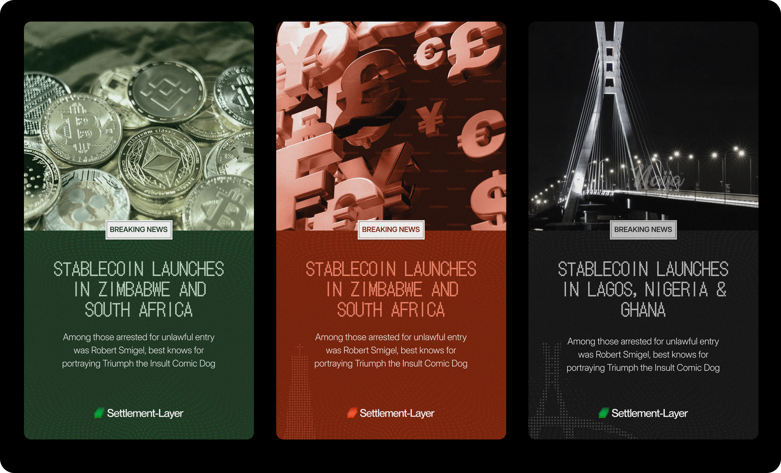
The system needed enough personality to be recognised and enough flexibility to carry very different kinds of content. An interview with a founder, a regulatory update, an ecosystem map, and a breaking news story should all feel related without looking identical.
Clear hierarchy helps readers understand what matters first. Consistent typography and layout create familiarity, while flexible compositions allow each story to keep its own character. The goal was not to make every asset look the same, but to give them a clear family resemblance.
That meant designing for repetition from the beginning. The identity needed to work for the first story and for the fiftieth.
Click to expand
The Brand
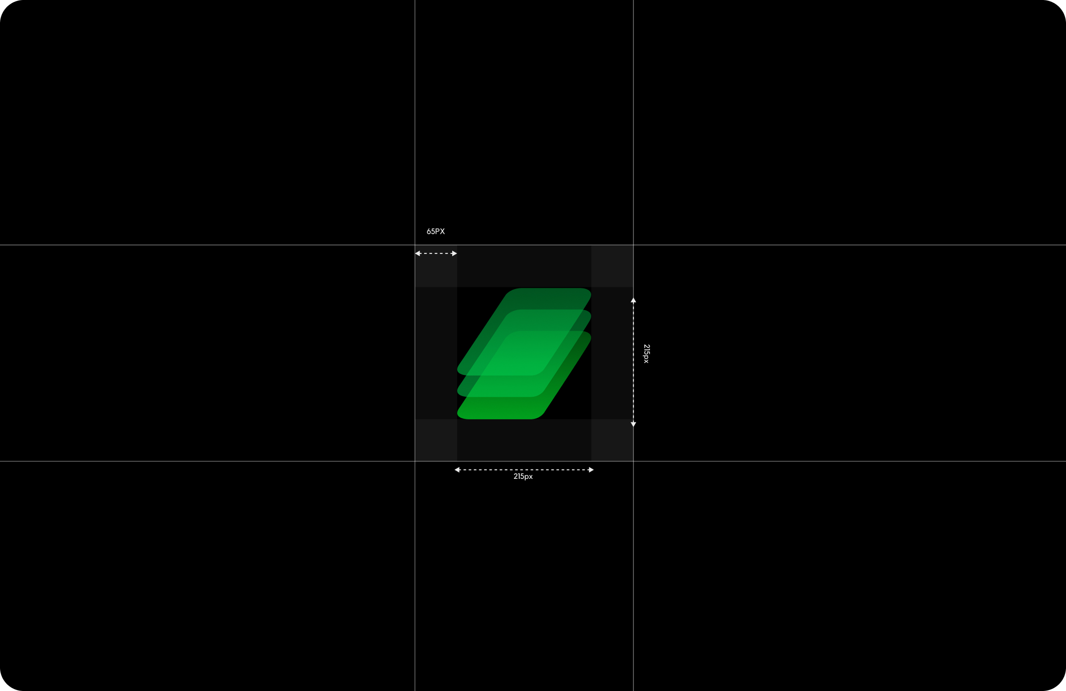
The Logo
Color
Typography
Click to expand
In use
One conversation becomes many entry points.
01The website
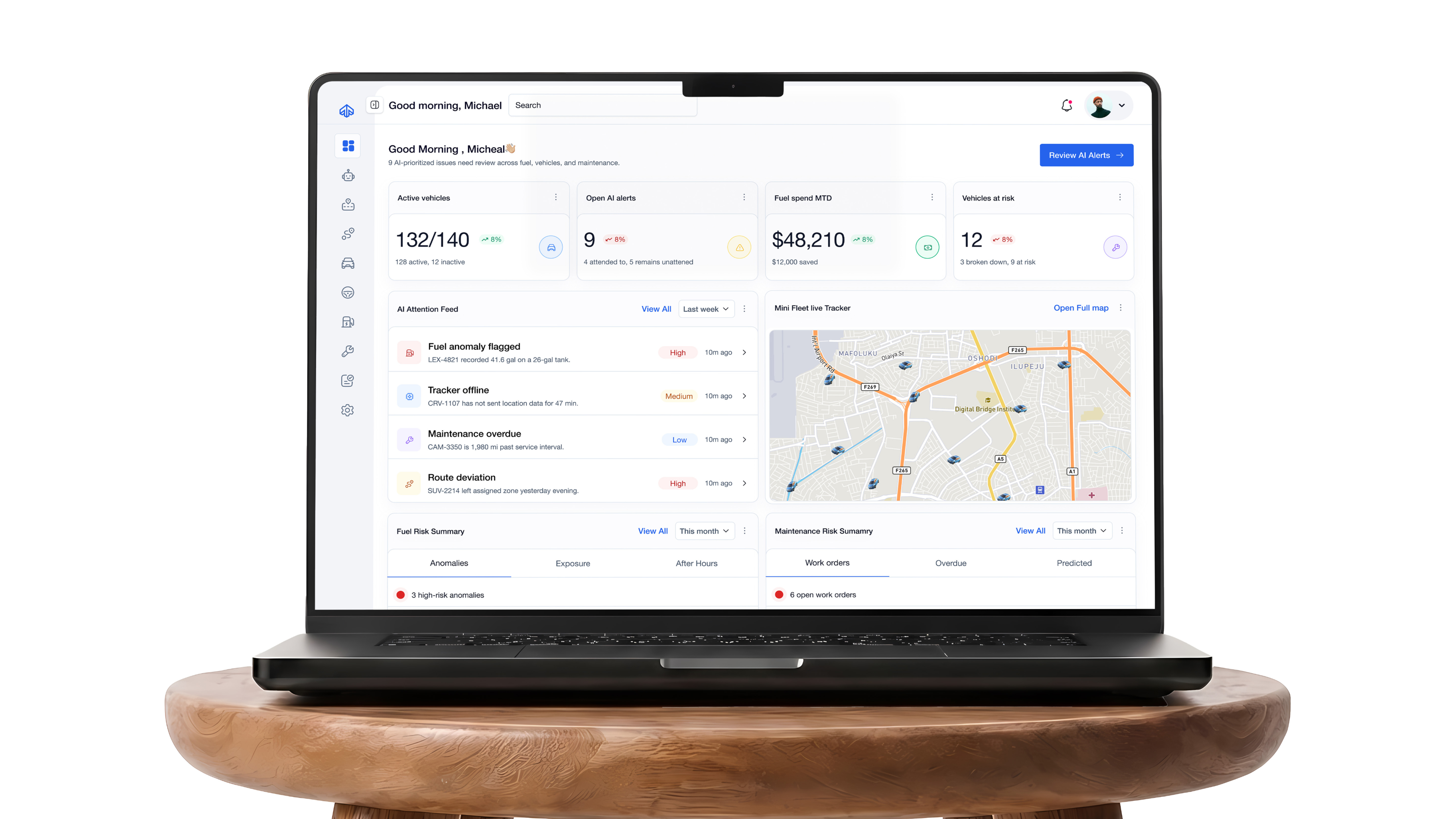
I treated the website as a publication rather than a brand brochure. Its job is to help visitors quickly understand what The Settlement Layer covers, discover conversations and research, and move naturally between related subjects.
The design prioritises reading, context, and discovery. The identity stays visible throughout, but never competes with the stories or the people being featured. Across desktop and mobile, the layouts were designed to support a growing body of interviews, articles, videos, and industry research.
Social posts disappear quickly in a feed. The website is where important conversations and resources remain accessible.
Visit the publication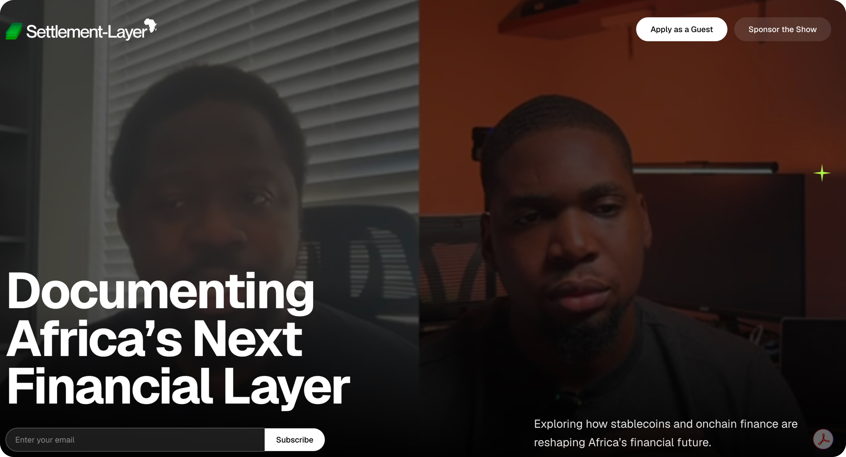
02LinkedIn
LinkedIn is one of The Settlement Layer's most important public touchpoints. It is where many founders, operators, investors, and financial professionals already discuss the subjects the platform covers, so the brand needed more than resized website graphics.
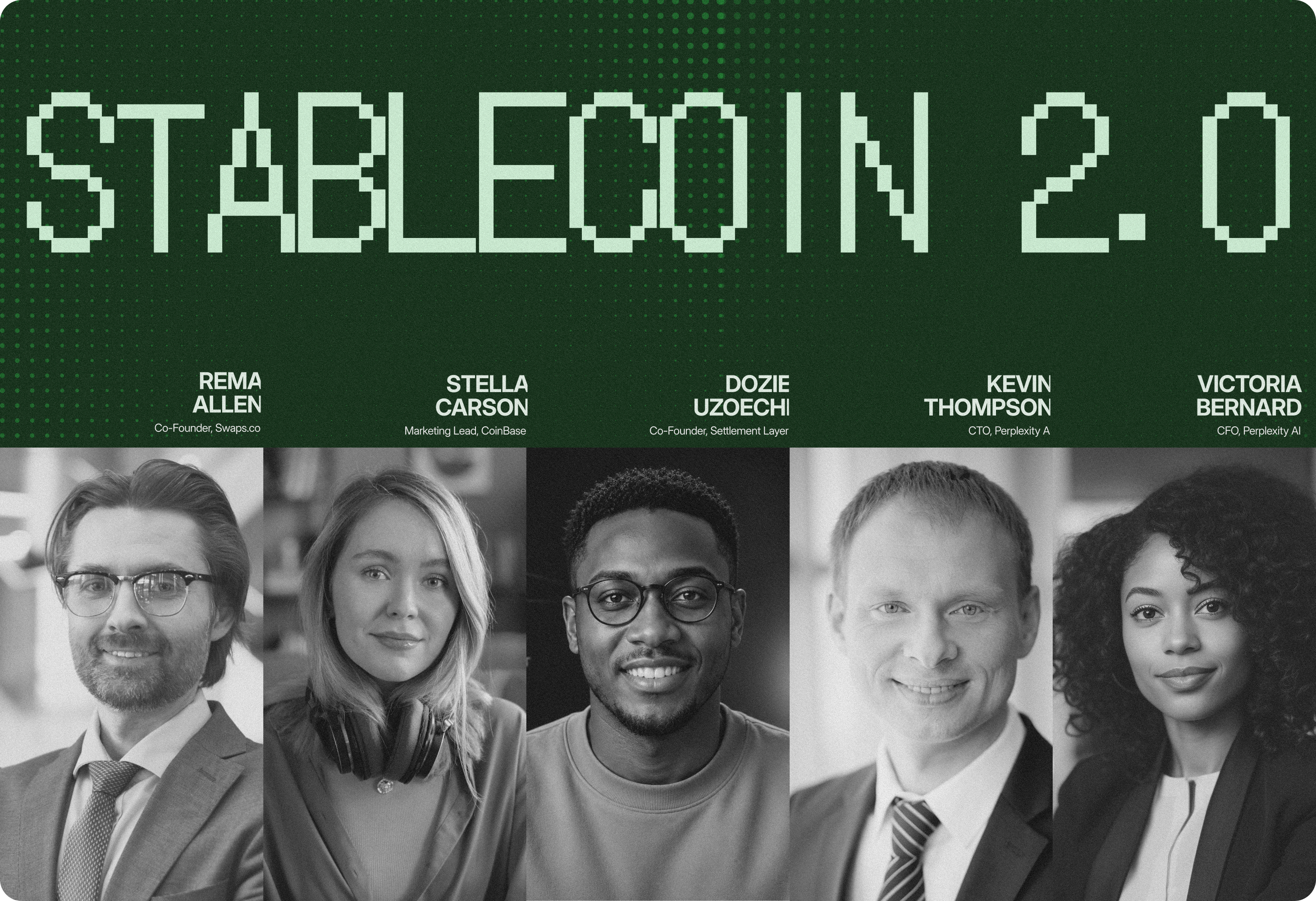
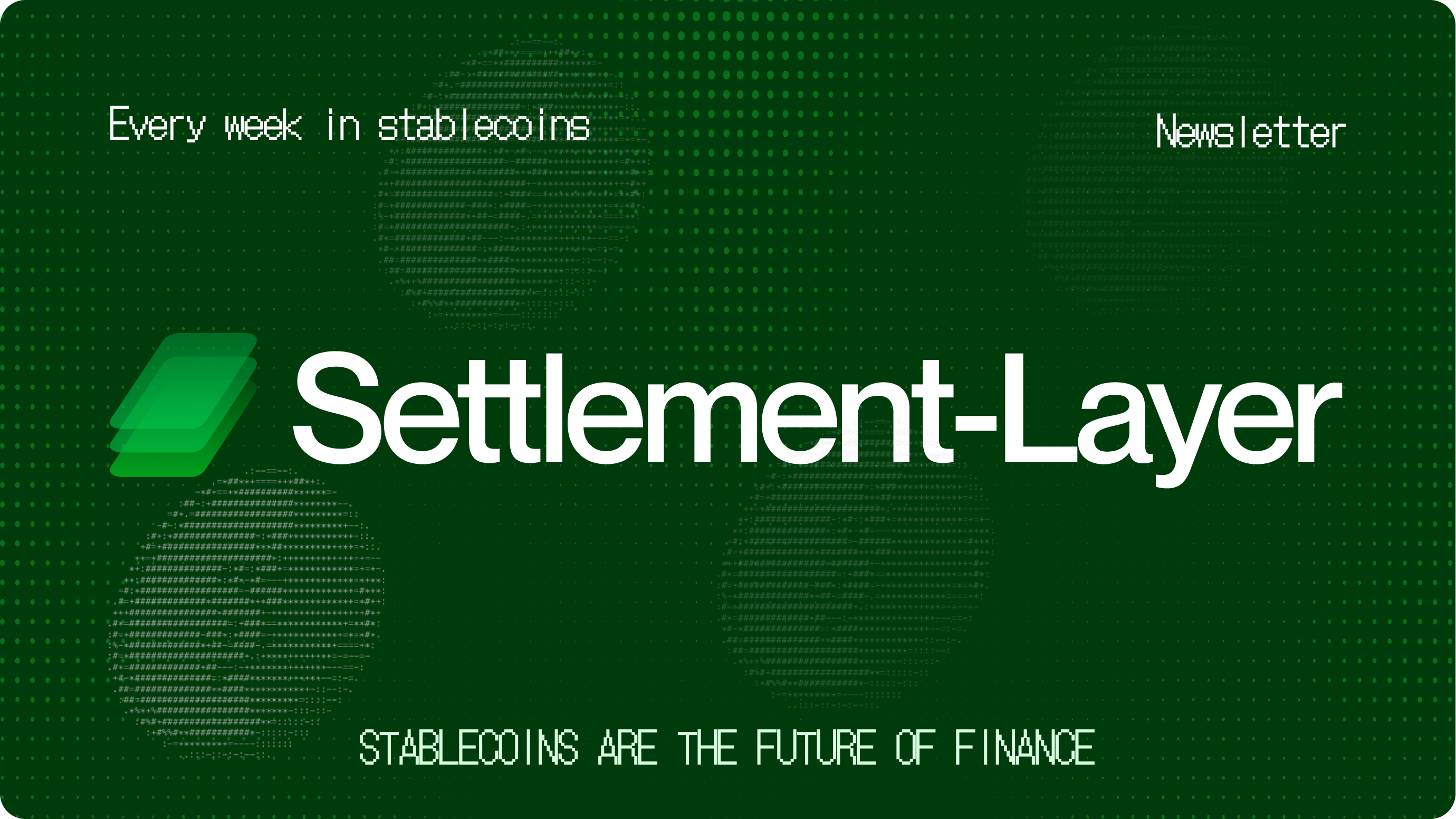
I extended the identity into a repeatable content system for newsletter covers, episode announcements, expert quotes, company news, ecosystem maps, explainers, and short video clips. Each format has a different job, but they share a consistent visual structure.
The system also creates rhythm in the feed. Some posts lead with people, others with data or headlines, but they still feel like they come from the same publication. The aim was to build recognition before someone even noticed the logo.
Read The Settlement Layer on LinkedIn03Video and motion
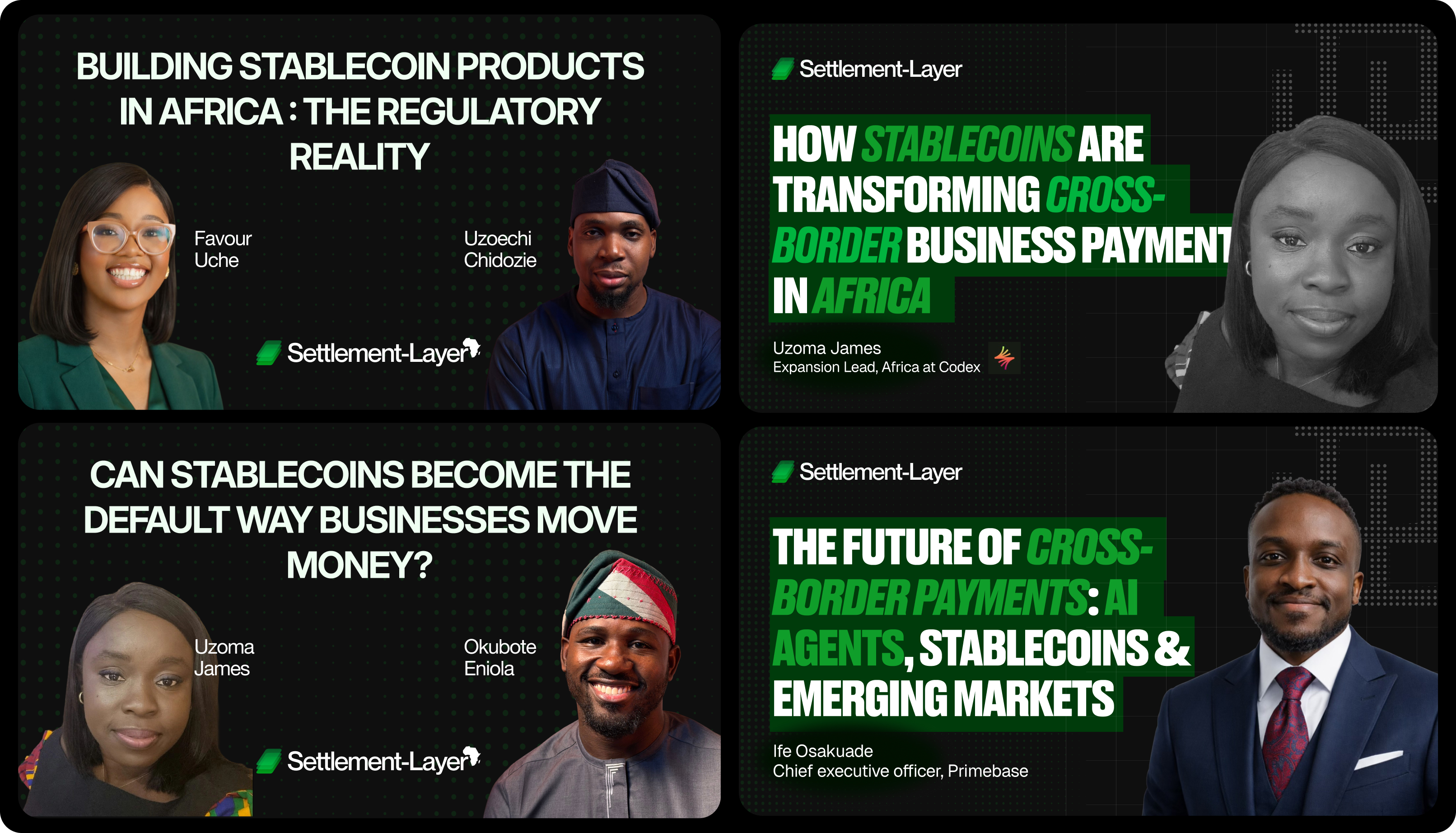
Interviews are central to The Settlement Layer. They let the audience hear directly from the people building, regulating, and operating financial infrastructure across Africa. The video system needed to frame that expertise without competing with it.
The identity was adapted for movement through episode openings, guest introductions, lower thirds, subtitles, thumbnails, transitions, end cards, and short-form clips. Each element helps establish context and guide attention while keeping the guest and the conversation at the centre.
The same system supports a full-length YouTube interview, a short LinkedIn clip, or a silent video viewed in a feed.
Watch the conversations on YouTubeI filmed, directed and edited the interviews, and designed the thumbnails. The title treatment system was created by Eniola Awosika; I produce each episode's titles from his template.
Outcome and reflection
A useful identity is not only something people recognise. It is something a team can keep using as the work grows.
The result is a brand capable of carrying a technical explainer, an in-depth interview, a market map, and a timely social post without losing its identity. More importantly, the system gives The Settlement Layer room to grow: new subjects, formats, and contributors can be introduced without redesigning the brand each time.
This project changed how I think about identity design. The real test was not whether the brand looked strong in a single presentation. It was whether it could support weekly publishing, different subject matters, changing formats, and several distribution channels without becoming repetitive or inconsistent.
The strongest outcome was not one logo, webpage, or social post. It was a visual language that can move with the platform, from deep research to everyday conversation.
As the platform grows, the next opportunity is richer data visualisation, more defined motion principles, and new ways of connecting related stories across the website and social channels.